Cards are containers that can display content and actions on a single topic.
They should be easy to scan for relevant and actionable information. Elements, like text and images, can be placed on them in a way that clearly indicates hierarchy.
FGX.CardPanel.TfgCardPanel is a such control in FGX Native.
Elevation
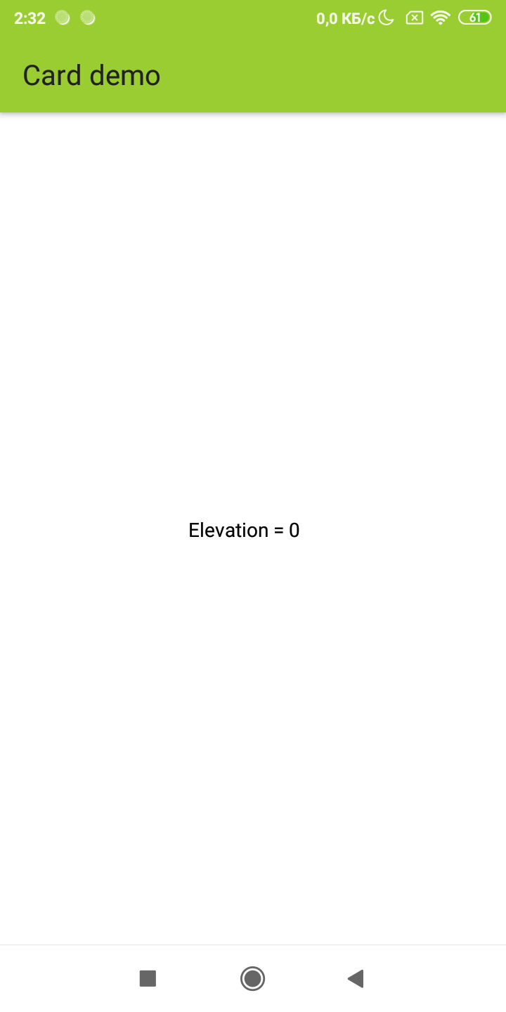
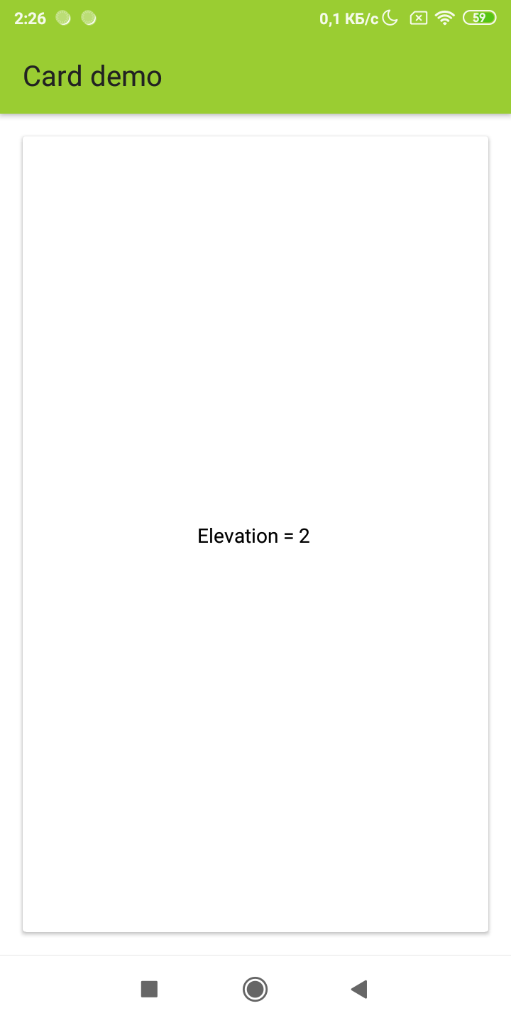
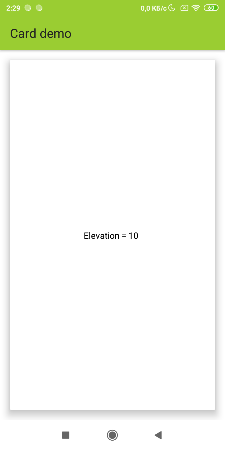
Elevation FGX.CardPanel.TfgCardPanel.Elevation allows you highlight content of card with shadow effect. The higher the elevation, the greater the shadow.
Background color
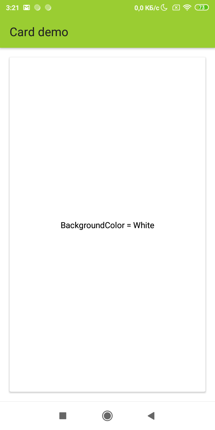
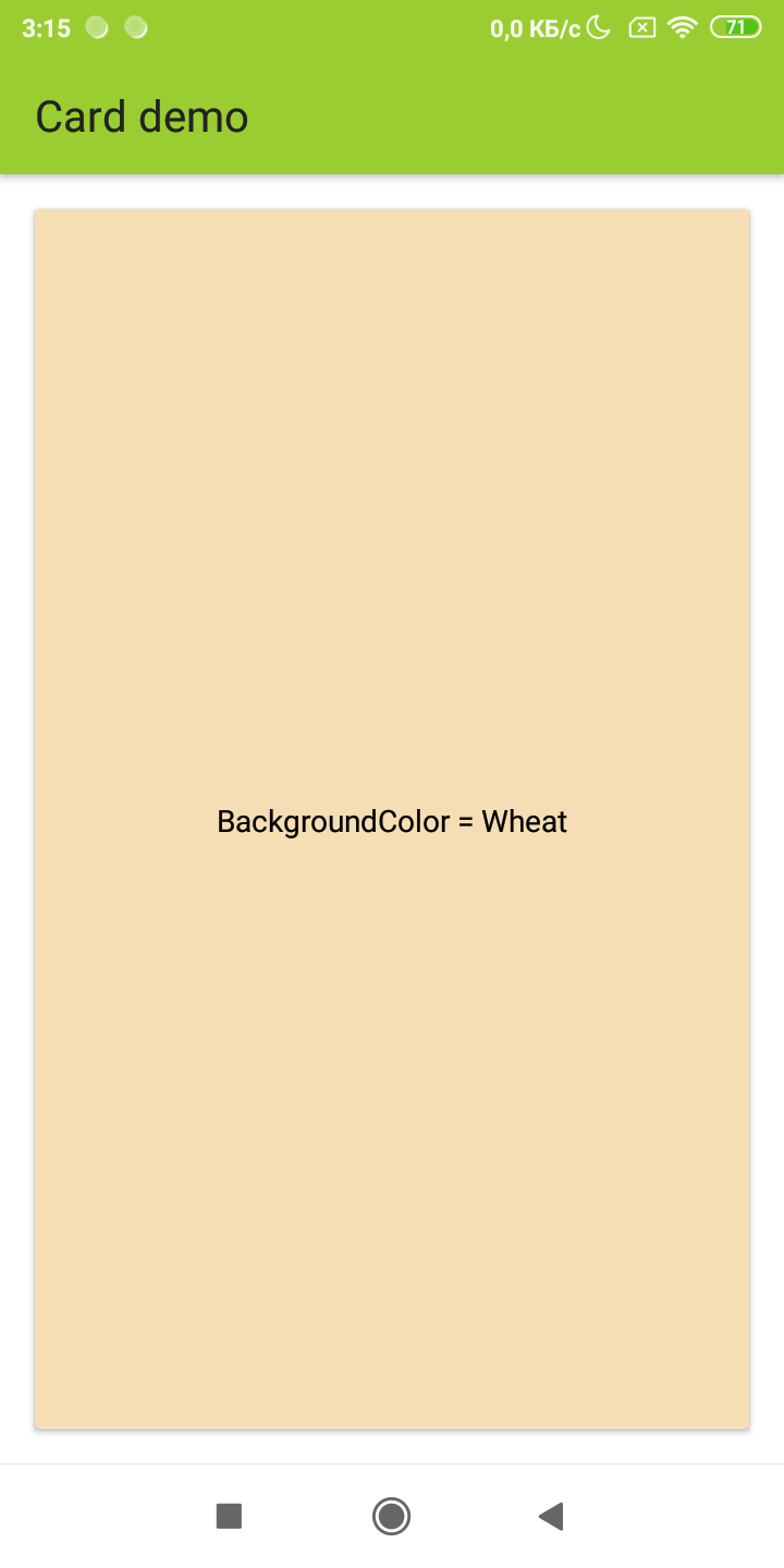
By default, the background color is taken from the current theme, namely from asset with name Theme\Surface. However, if you want to specify your color, this can be done via BackgroundColorName or BackgroundColor
Corners radius
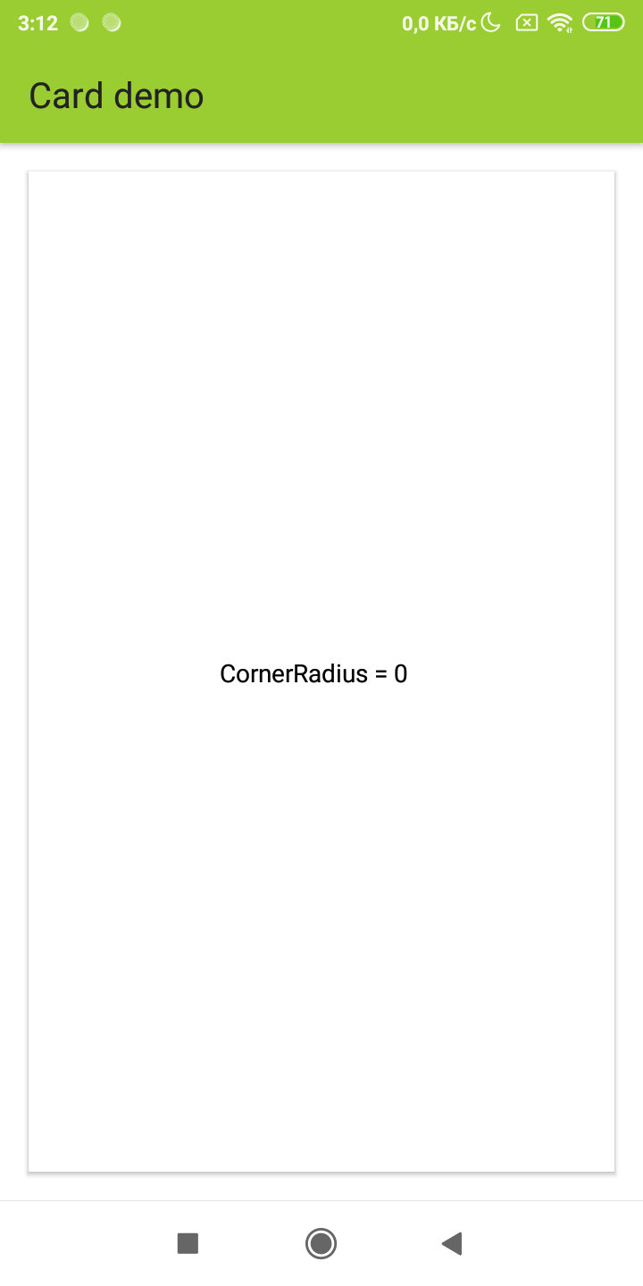
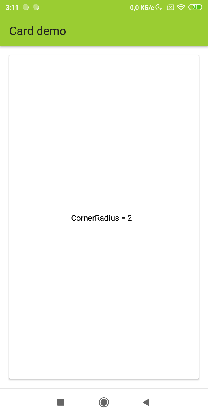
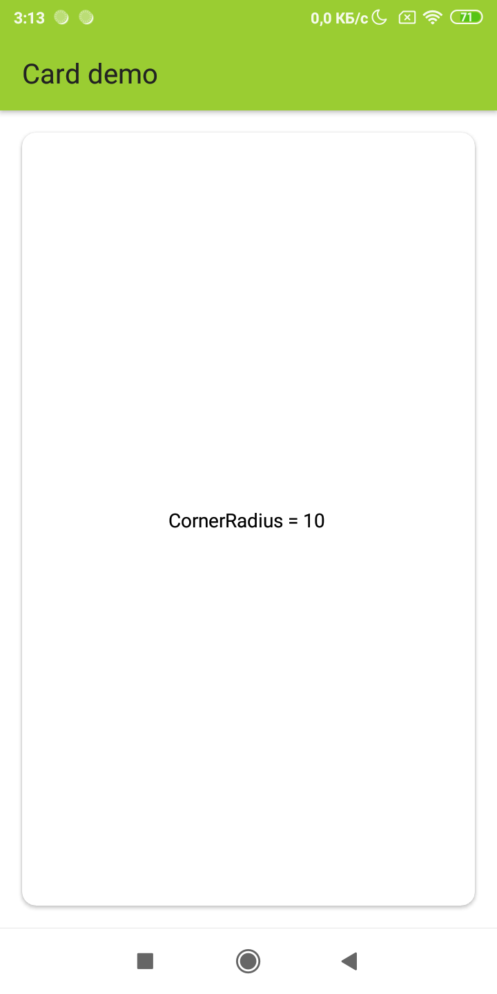
In addition to the background color and elevation, you can specify to round the corners of the panel through CornerRadius.