"Pickers" is an auxiliary functionality for entering values of different types (date/time, etc.) without using and layout of a separate form or a group of UI components. Picker is not a separate UI component. It is a utility class that, depending on the target platform, offers a native way for the user to select a value.
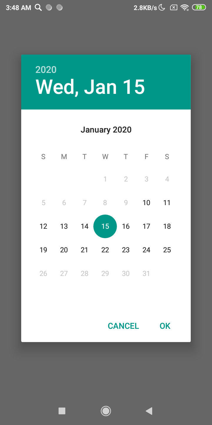
Date picker
Date pickers let users select date.
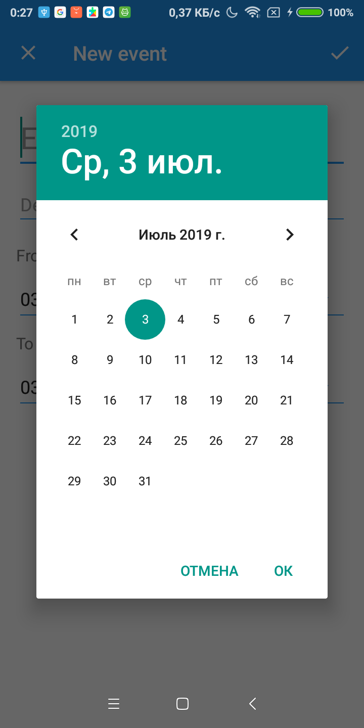
Work with the picker is carried out through the auxiliary class FGX.Pickers.Date.TfgPickerDate. This class allows you to configure the parameters and logic of the picker.
Fast showing date picker
If you don't have complicated logic and you just want to get selected date from user, you can use lightweight version of picker factory FGX.Pickers.Date.TfgPickerDateFactory.PickDate.
TfgPickerDateFactory.PickDate(Self, EncodeDate(2020, 1, 1), procedure (const ASelectedDate: TDate) begin
  TfgToast.Show('Selected date: ' + DateToStr(ASelectedDate));
end;
Note that the picker instance obtained in this way will be released by the library automatically. So you don't have to destroy it.
Allocation
The picker instance is obtained by available method of a factory FGX.Pickers.Date.TfgPickerDateFactory.CreatePicker. After getting instance you can setup event handlers or callbacks for tracking picker changes or picker visibility.
uses
  System.SysUtils, FGX.Pickers.Date, FGX.Toasts;

var
  DatePicker: TfgPickerDate;
begin
  DatePicker := TfgPickerDateFactory.CreatePicker(Self);
  DatePicker.Date := EncodeDate(2020, 1, 1); // By default picker uses today
  DatePicker.OnDateSelectedCallback := procedure (const ASelectedDate: TDate) begin
    TfgToast.Show('Selected date: ' + DateToStr(ASelectedDate));
  end;
end;
Date range
The date picker supports selecting date from range. You can specify bounds: minimum date, maximum date or min and max dates together.
DatePicker.MinDate := EncodeDate(2020, 1, 10);
DatePicker.MaxDate := EncodeDate(2020, 1, 25);
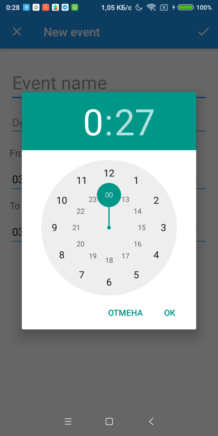
Time picker
Time pickers let user select time.
Fast showing time picker
If you don't have complicated logic and you just want to get selected time from user, you can use lightweight version of picker factory FGX.Pickers.Time.TfgPickerTimeFactory.PickTime.
TfgPickerTimeFactory.PickTime(Self, EncodeTime(15, 30, 0, 0), procedure (const ASelectedTime: TTime) begin
  TfgToast.Show('Selected time: ' + TimeToStr(ASelectedTime));
end;
Note that the picker instance obtained in this way will be released by the library automatically. So you don't have to destroy it.
Allocation
The picker instance is obtained by available method of a factory FGX.Pickers.Time.TfgPickerTimeFactory.CreatePicker. After getting instance you can setup event handlers or callbacks for tracking picker changes or picker visibility.
uses
  System.SysUtils, FGX.Pickers.Time, FGX.Toasts;

var
  TimePicker: TfgPickerTime;
begin
  TimePicker := TfgPickerTimeFactory.CreatePicker(Self);
  TimePicker.Time := EncodeTime(15, 30, 0, 0); // By default picker uses Now time
  TimePicker.OnTimeSelectedCallback := procedure (const ASelectedTime: TTime) begin
    TfgToast.Show('Selected time: ' + TimeToStr(ASelectedTime));
  end;
end;