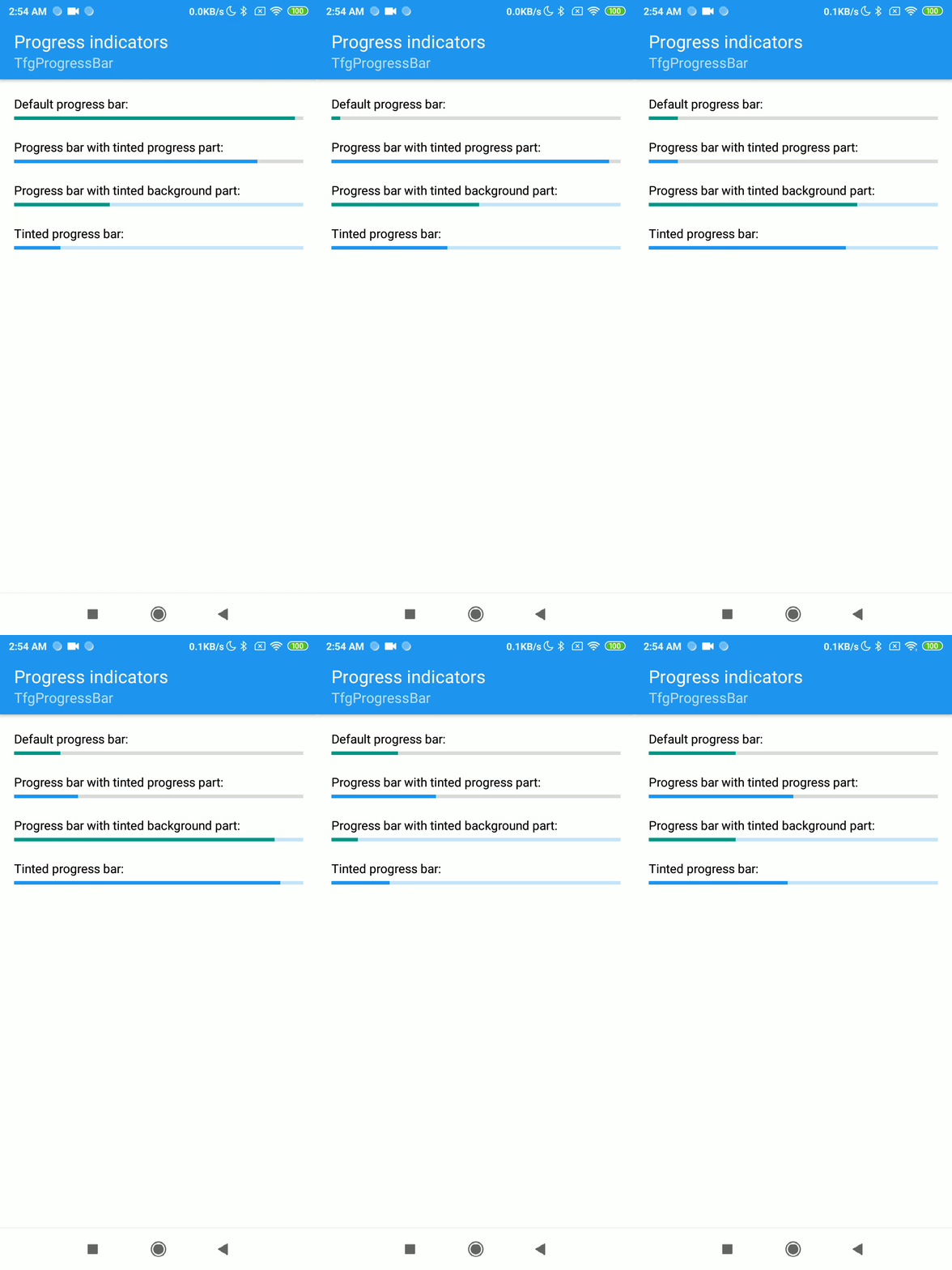
Progress indicators express an unspecified wait time or display the length of a process.
FGX Native provides 2 components TfgActivityIndicator for indeterminate and TfgProgressBar for determinated progress.
Indeterminated progress
Indeterminate progress component is presented by FGX.ActivityIndicator.TfgActivityIndicator.
Start/Stop
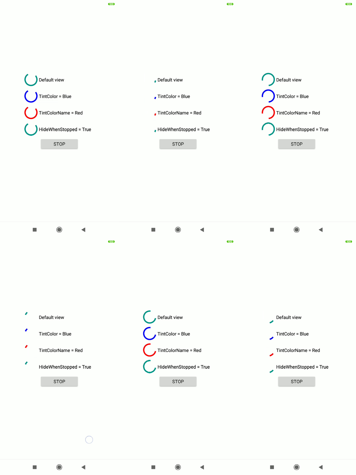
Tou can manually start and stop indicator. When you stop indicator, it automatically hide control from screen.
Appearance
You can tune activity indicator color into your brand color scheme via TintColor or TintColorName.
By default, the TfgActivityIndicator takes tint color from the current theme, namely from asset with name Theme\Secondary\Color.
Determinated progress
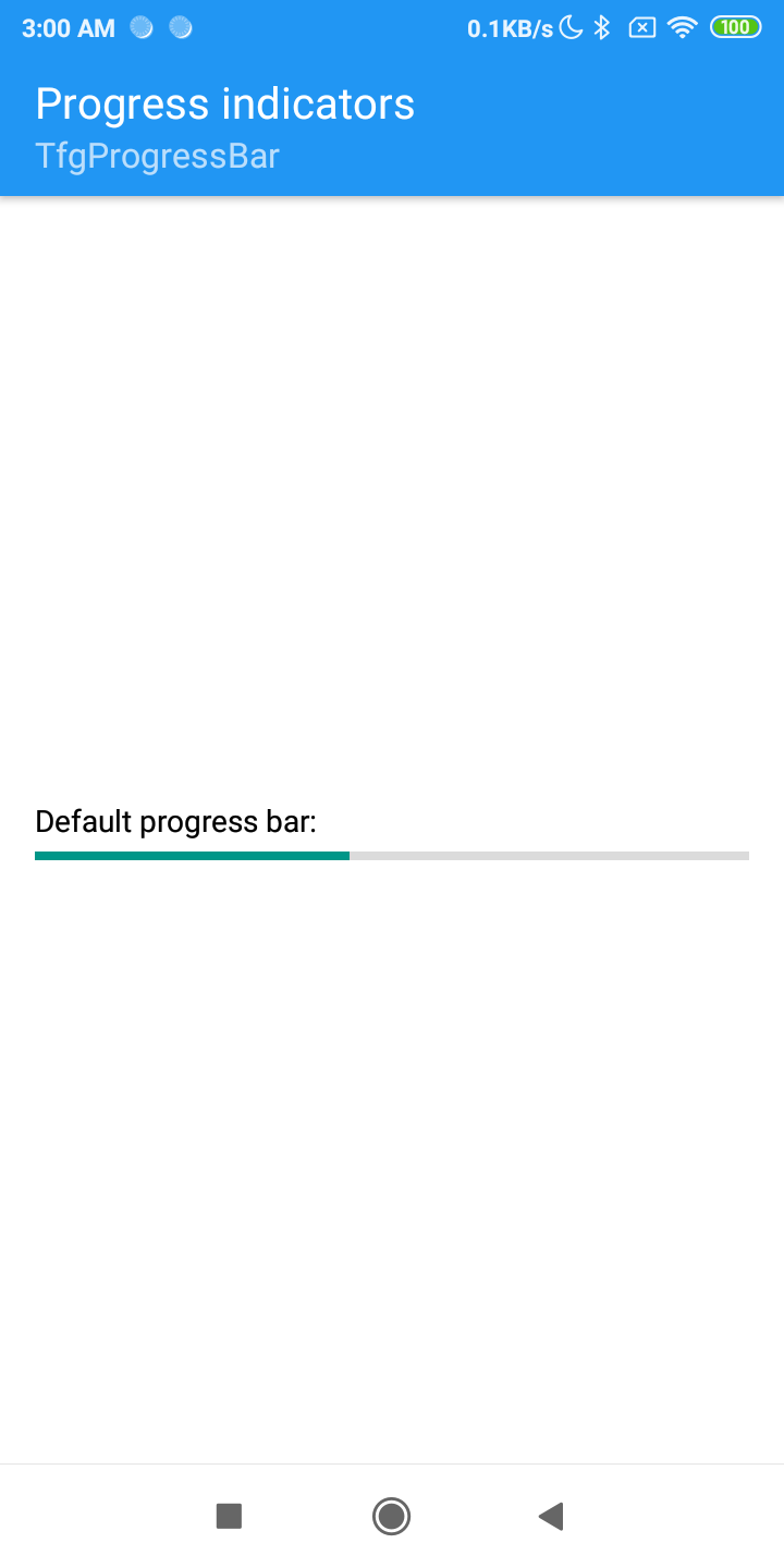
Determinate progress component is presented by FGX.ProgressBar.TfgProgressBar.
Progress bounds
For convenience of using progress bar for showing operation in custom units (Megabytes, counts and etc) control supports Min, Max and Progress values.
Appearance
You can tune progress bar colors into your brand color scheme via TintColor/TintColorName for progress part and BackgroundTintColor/BackgroundTintColorName for tinting background part.
By default, the TfgProgressBar takes tint colors from the current theme, namely from asset with name Theme\Secondary\Color it takes tint color for progress part and Theme\Secondary\Light Color for background part.