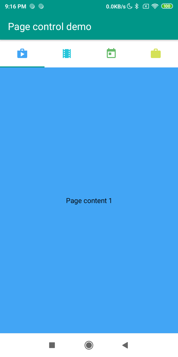
Tabs organize content across different screens, data sets, and other interactions.
Tabs are represented by FGX.PageControl.TfgPageControl control in FGX Native.
Tabs height
You can change height of tabs via TabsHeight property and specified required value.
Disabling Swipe
If you don't want to allow your user swipe pages, you can disable it via SwipeEnabled property.
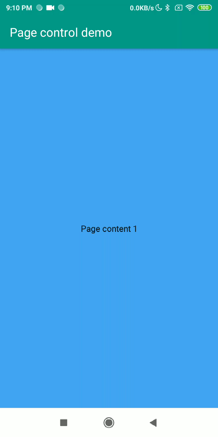
Tabs position
TfgPageControl provide special option TabsPosition for changing or hiding tabs. A very useful feature is to hide the tabs to make the content scrollable with your finger. It will open a new way for using TfgPageControl for creating multisteps wizards.
Tabs Icons
If you don't like simple text on tab or would like to use icons for better User Experients, you can specify icons for each tab via TfgPage.IconName.
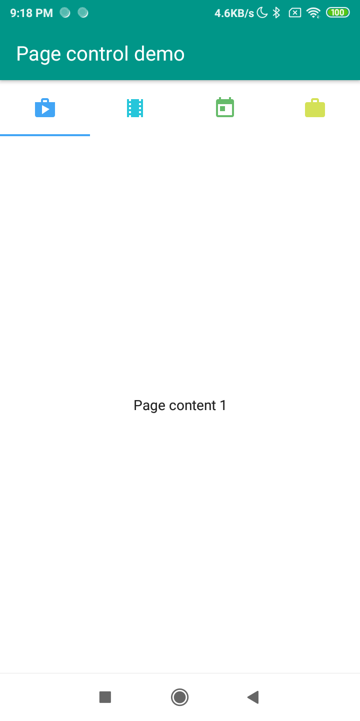
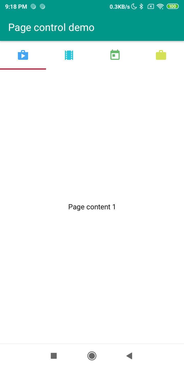
Appearance
TfgPageControl also supports tinting for following your brand color scheme. You can specify tint color via TintColor or TintColorName.
By default, the TfgPageControl takes tint color from the current theme, namely from asset with name Theme\Primary\Color.
Events
If you would like to control changing pages you can use followed events:
- Tracking end states:
OnChanged,OnPageSelected. - Tracking process of changing:
OnPageSelecting.